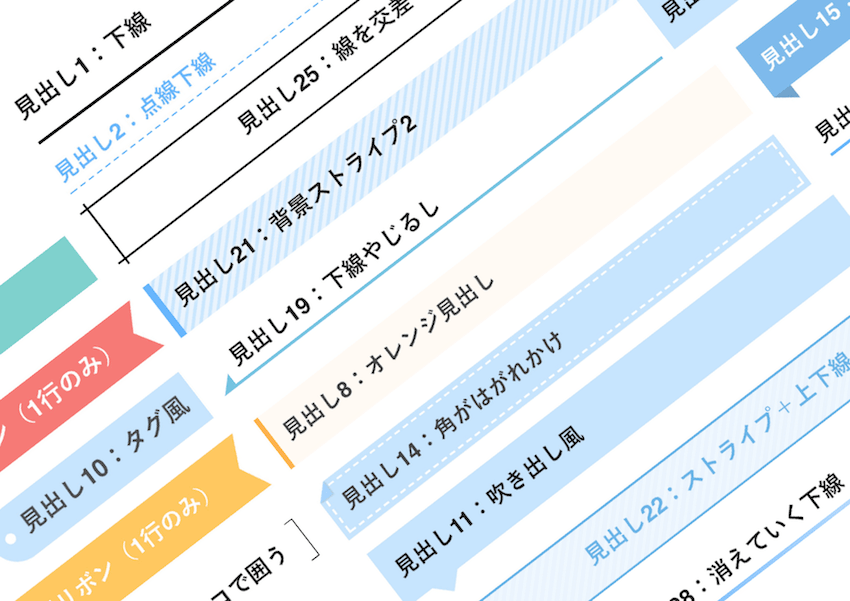
wordpressでサイトを作っておられる方へ少し便利なコピペ見出しのご紹介です。前回の見出しCSSコピペにアクセス数が多かったので、皆さん興味あると思いますので、今回はもうちょっと可愛い見出しCSSを記載いたします。
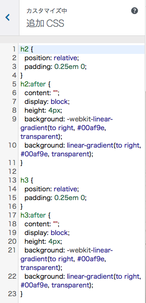
そうなんや〜と思ったくらいで大丈夫!あとはwordpressの外観からカスタマイズ、追加CSSのところにコピペ!見出しの文字がキラキラチェンジ!(笑)

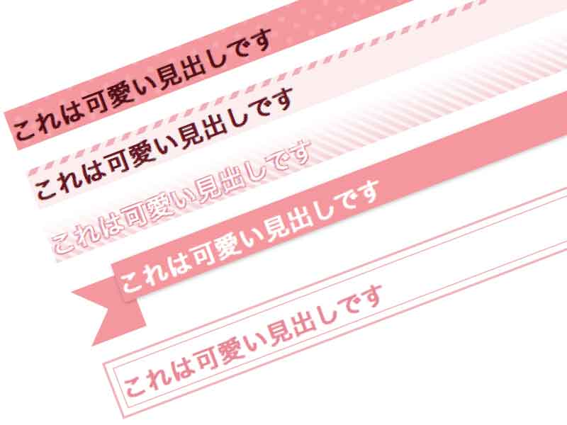
h2 { border: 1px solid #f0bdc4; / color: #e7939f; / margin: 20px 10px; / padding: 10px; / position: relative; z-index: 0; } h2:before { border: 2px solid #f0bdc4; / content: ”; display: block; position: absolute; top: –8px; bottom: –8px; left: –8px; right: –8px; z-index: –1; }

h2{ color: #fff; / padding: 5px 10px; / position: relative; text-shadow: –1px –1px 1px #e18692, 1px –1px 1px #e18692, –1px 1px 1px #e18692, 1px 1px 1px #e18692; / z-index: 0; } h2:before{ background: repeating-linear-gradient(45deg, #f5d5da, #f5d5da 4px, #fcf0f1 0, #fcf0f1 7px); / content: ”; position: absolute; top: 0; bottom: 0; left: 0; right: 0; z-index: –2; } h2:after{ background: linear-gradient(180deg, rgba(255,255,255,1), rgba(255,255,255,.1)); / content: ”; position: absolute; top: 0; bottom: 0; left: 0; right: 0; z-index: –1; }

h2{ background-color: #fcf0f1; / color: #701722; / padding: 10px; / position: relative; } h2:after{ background: repeating-linear-gradient(-45deg, #f0b8bf, #f0b8bf 5px, #fcf0f1 0, #fcf0f1 10px); / content: ”; height: 5px; / position: absolute; left: 0; top: 0; right: 0; z-index: 1; }

h2{ background-color: #f3a3a8; / background-image: radial-gradient(#f5b2b6 20%, transparent 0), radial-gradient(#f5b2b6 20%, transparent 0); / background-position: 0 0, 10px 10px; background-size: 20px 20px; color: #590c11; / padding: 10px; / }